Project Corrections / Time Spent: (2 1/2 hours)
I basically went over the feedback I receive from Brother Stucki for each project and I corrected them.
1. Event Ad, the word “building” was alone, so I fixed that.
2. Photodesign: I add a third color to complete the color scheme, Analogous: Brick-Orange-Gold
3. PhotoMontage: I add a third color to complete the color scheme, Triadic: Blue-Green-Brick
4. Stationary: I add a third color to complete the color scheme, Split Complementary: Red-Orange-Teal
I used mockups in order to present the project in my portfolio.
Message: Show the quality of my work to potencial clients and employers.
Audience: Potential client and employers.
Top Thing Learned: Work with master pages in Adobe indesign and how to screen record, this is something that I was looking.
Future application of Visual Media: I’ll be start working here in Guadalajara, I need to design business cards, brochures and my website for myself.
Color scheme and color names: Monochromatic, Orange
Title Font Name & Category: Bebas – Sans Serif
Copy Font Name & Category: Egyptian Slate – Slab Serif
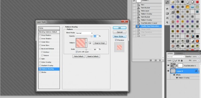
Thumbnails of Images used: I used a Pattern Overlay

