P9-Portfolio

Project Corrections / Time Spent: (2 1/2 hours)
I basically went over the feedback I receive from Brother Stucki  for each project and I corrected them.

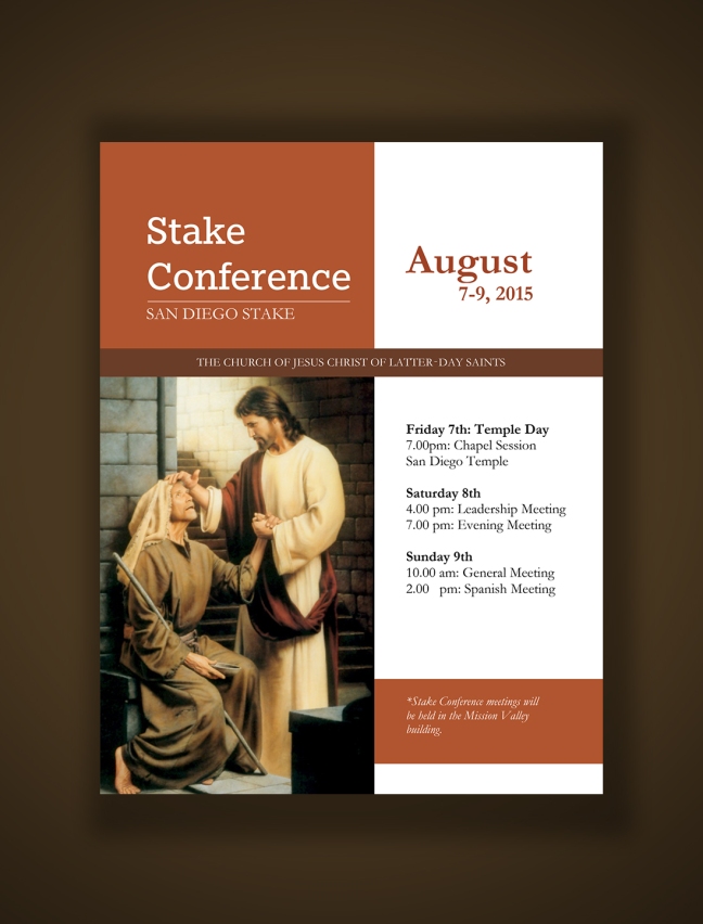
1. Event Ad, the word “building” was alone, so I fixed that.
2. Photodesign: I add a third color to complete the color scheme, Analogous: Brick-Orange-Gold
3. PhotoMontage: I add a third color to complete the color scheme, Triadic: Blue-Green-Brick
4. Stationary: I add a third color to complete the color scheme, Split Complementary: Red-Orange-Teal

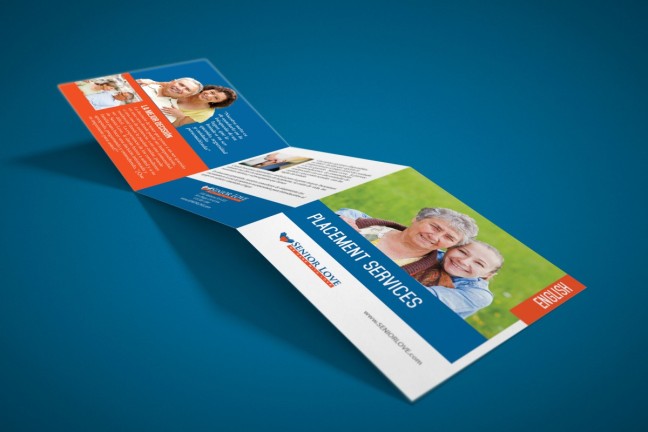
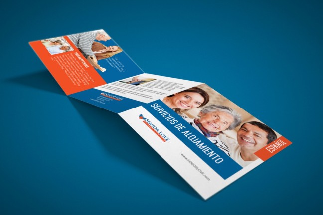
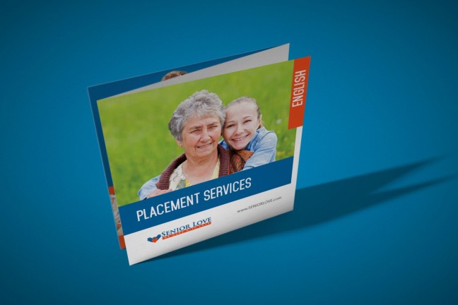
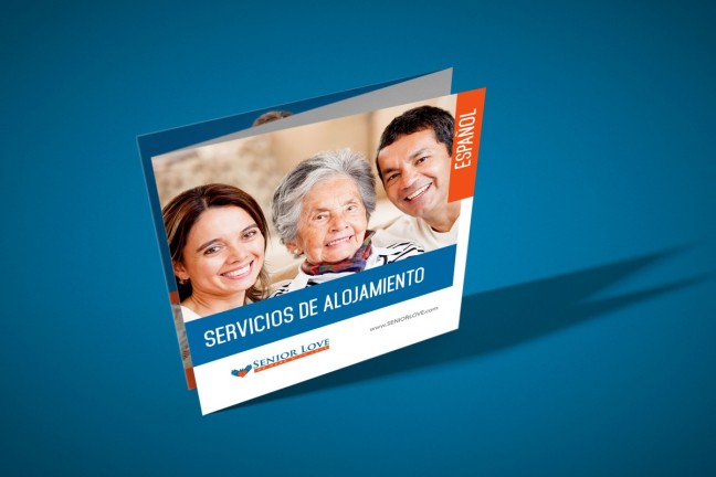
I used mockups in order to present the project in my portfolio.

Message:  Show the quality of my work to potencial clients and employers.

Audience: Potential client and employers.

Top Thing Learned: Work with master pages in Adobe indesign and  how to screen record, this is something that I was looking.

Future application of Visual Media: I’ll be start working here in Guadalajara, I need to design business cards, brochures and my website for myself.

Color scheme and color names: Monochromatic, Orange

Title Font Name & Category: Bebas – Sans Serif

Copy Font Name & Category: Egyptian Slate – Slab Serif

Thumbnails of Images used: I used a Pattern Overlay

Untitled-2

Project 08: Brochure

brochure_englishside

brochure_spa_side

brochure_ENG

brochure_spa

Description:
Square Tri-fold Brochure, Z folded  

Process (Programs, Tools, Skills):

Using a hand-image as a reference, I draw a hand in Illustrator to create the logo, I duplicate the hand and add a heart between to finished it.  I set up a 15 in. x 5 in. page  in Adobe InDesign and I divide it  in 3 parts (5 in. each).  I started with the design process by placing the images and the text,  I cropped two images in Photoshop using the quick selection tool, refine image and cleaning the images using the brush tool  and then I tried to wrap text with this images, is hard to notice the wrapping text in the English side because I didn’t have enough text but you can notice the wrapping text in the Spanish part. It was a fun project

Programs/Tools Used:Adobe InDesign/Adobe Illustrator/Adobe Photoshop

Message: Provides information in English and Spanish about placement services (Senior Housing)

Audience: People looking for housing for their loved ones.

Top Thing Learned: The main thing I learned is how to wrap text around an image in InDesign.

Color scheme and color names: Complementary; Blue and Orange.

Title Font Name & Category: Bebas Nune / Sans Serif

Copy Font Name & Category: Palatino / Old Style

Word count: 346

Thumbnails of Images used:

Sources (Links to images on original websites): I have membership in http://www.depositphotos.com and I downloaded the images from this webside


Screenshots:

p8JoseOreDraftB2

p8JoseOreDraftB

Project 7 Web Page

p7JoseOreScreenshot

Description:
HTML/CSS Web Page created to showcase “FUZIONES” Peruvian Handicraft Logo

Process (Programs, Tools, Skills):

In the critiques, the teacher suggested to work in the colors of the logo to complete the color wheel and I come up with the split complementary color scheme (Red, orange and teal) and I’m very happy with the result.
Continue reading Project 7 Web Page

Project 06: Stationary

P6JoseOreBC1 P6JoseOreLH1


Description: Stationery project: Business card and letterhead for Fuziones: Peruvian handicraft

Process (Programs, Tools, Skills)I look for ideas in Pinterest and I found this beautiful Peruvian pattern that I iused as a reference for the logo and the color scheme. I opened Adobe Illustrator and create the Logo by using the Pen Tool also I create a QR code in https://www.the-qrcode-generator.com/

Continue reading Project 06: Stationary

Project 03: Photodesign

click here to see the full sized image

Description: Create a composition by using a photography and design elements
Process For this project I used a picture I took at George Washington’s Mount Vernon. I started it by editing the picture adding contrast and adjusting vibrance. Then using eyedropper tool, I selected the colors I used. I really like the color scheme of this picture so I had nice colors to work with; complementary Gold and Orange are the colors I used.  I add the verbiage from Mount Vernon website using two contrast fonts. I finish by adding lines based in the color scheme I used.

  • Program/tools used: Adobe Photoshop CC
  • Camera: Canon 6D
  • Lens: Canon EF 24-105mm f/4 L IS USM

Continue reading Project 03: Photodesign

Project 04 Montage

click here to see the full sized image

Description: A classic photomontage: The temple with a picture of The second coming behind it.  The temple I used for this project is the Trujillo Peru temple, which will be dedicated Sunday, June 21.

Process:Screen Shot 2015-05-30 at 1.20.29 AM

  1. I cropped the temple image using the quick selection tool and then I added a mask with black paint and 100% opacity. I refined the edges.
  2. I placed the sky image and I applied Gaussian Blur filter.
  3. I placed the “Second Coming” image and I changed the blending mode to overlay and 75% opacity and then I applied Smart filter, Gaussian blur. Using black brush tool I paint over Jesus, so the filter is only applied in the edges of the image.
  4. Finally, I added a quote by President Monson, using two contrasting fonts.
    Program/tools used: Adobe Photoshop CC

Continue reading Project 04 Montage

Project 03 Activity: Photography

I’m having a crazy week, I’m moving to Guadalajara, Mexico, because of my wife’s job.I’m Currently  in Houston, TX trying to finish with my school assignments while my wife is finishing some paperwork. I actually took the pictures of my son for Focus: Background and Foreground in the Hotel couple minutes ago.

Photography is my favorite hobby, I bought a DRLR camera last year and  I been trying to get some practice ever since, I just to have a Lynda.com subscription where I learned, among other things, basic concepts of photography, also I watched tons of video tutorial in Youtube, I’m learning how to shoot in manual mode,  I think I’m getting in there.


Business 250-Lesson 03

This week we finished with project 01, choosing a product. The spreadsheet that the instructor provide us for this project was very useful, what I learned is going to help me to make a decision about the business I’m going to create and how I can advertise my business.

Choosing a Site Builder 

I did my research in the following web builders:

  • Wix
  • Dreamweaver
  • WordPress

1.     WIX is easy to use builder to create professional and good looking sites. Absolutely no technical skills are required and sites are 100% search engine friendly. Wix offer over 500 professional templates. The way to create websites with wix is based on drag & drop interface.

Continue reading Business 250-Lesson 03

Project 02, Event Ad

Description:
San Diego Stake Conference,
Event Ad.

Process: I used this image titled “From Darkness To Light “, as a focal point. I created  a box in the top of the image where I included the title; those elements are located in the left part of the layout. I included a narrow box where I wrote the name of the Church. In the right part of the layout I included the information regarding the meetings. I finished by creating a box where I wrote the venue.
Continue reading Project 02, Event Ad